Key takeaways:
- Also known as candlestick charts, candlestick charts are made up of three parts – body, shadow and color, with four data points – High, Low, Open, and Close.
- We can analyze each candlestick from three angles: the size of the body, the length of the shadow, and the volume.
- Because of their simplicity, beauty and ease of interpretation, candlestick charts are widely used in various financial asset markets.
Detailed explanation of the concept
A candlestick chart is a price chart that shows the high, low, open, and close prices of a financial asset over a specific timeframe.
Candlestick charts were invented in the 18th century by a Japanese rice merchant named Munehisa Honma, who first used candlestick charts in the rice futures market. In the 1990s, an American named Steve Neeson introduced candlestick charts to the Western financial world by publishing the book “Japanese Candlestick Chart Techniques”. Since then, Munehisa Honma’s candlestick chart theory has been continuously revised and adjusted to make it more applicable to modern financial markets.

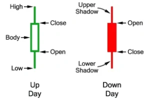
The chart above shows the components of a candlestick chart.
A candlestick chart usually consists of three parts: the body, the shadow, and the color.
There are four data points in each candlestick: the open, high, low, and close for a specific time period.
The opening price is the price at which the first trade was traded in that particular period, and the closing price is the price at which the last trade was traded in that period. A rectangle drawn by connecting the opening and closing prices is considered to be the body of the candlestick.
The vertical line connecting the high price and the body is called the upper shadow of the candlestick. The vertical line connecting the Low and the body is called the lower shadow.
If the closing price is higher than the opening price, the candlestick is usually plotted as a hollow green color, forming a white candlestick that represents the price increase. Conversely, if the closing price is lower than the opening price, the candlestick is usually painted red as a solid red to indicate a black candlestick.
The special case occurs when the opening and closing prices are almost equal, and the candlestick in this case is often called a “doji”.
In summary, the body shows the opening and closing prices of the day, the shadows show the highs and lows of the day, and the colors indicate the direction of movement during the formation of the candlestick.
How to interpret candlesticks
Each candlestick tells the story of the game between bulls and bears. To become a professional trader, the first thing you need to learn is to read candlesticks.
In general, traders can interpret candlesticks by examining the following three aspects:
1. Entity size
A white candlestick with a large body indicates that the buyer is in a strong position. Conversely, a black candlestick with a large body indicates that the seller is on the strong.
2. The length of the shadow
The long shadow indicates that the price was once very volatile, but eventually returned to its original price level, indicating that the market sentiment is in uncertainty. A short shadow indicates that the market is relatively mild. Generally speaking, the longer the shadow, the more likely it is that the price will move in the opposite direction of the shadow.
3. Trading volume
One of the key metrics to note when analyzing candlesticks is the volume of transactions tied to them. If the price increase is accompanied by an increase in trading volume, there is a greater possibility of an uptrend strengthening. However, if the price rises sharply and the volume decreases, it suggests that the rally may not last long.
Candlestick charts are a great way to convey market trading information, so they are widely used in various financial asset markets such as foreign exchange, commodities, treasury bonds, and stocks.


